Blending and Color Questions

Z

ZJOmega

Guest
So I am currently working on a project and am still new to airbrushing. If I want to get different shades of a color how do I approach it? For example I have Wicked red, how Would I acquire darker shade of it? Do I just add Like a drop of transparent black to darken it? Obviously to lighten it I would add a drop of white to the red to lighten. I didn't know if it was the same to darken or not. Thanks for any responses.
 
I am no expert when it comes to colours, so hopefully someone will chime in soon. For what its worth here's my view. Firstly I assume we're talking opaque red here? If it was Wicked detail you can just keep adding layer after layer and it will deepen/darken. Good for fades because you just hit the areas you want with more layers, and of course you can add a drop of trans black too if needed as you go. Can take a while because the red starts off very pink looking at first, but IMO gives a real subtle transition as you build up. You can add trans black to opaques as you suggested too, but it depends on how dark you need to go, you may be able to add a drop of something more subtle, maybe sepia? It's worth experimenting with this kind of thing. Go too far and things start to look 'muddy' To lighten adding white is going to send red toward pink, (black towards grey, though other colours will become more pastel shades of their original colour) so you may be better off adding transparent base. This reduces the amount of pigment by volume, so can give you a subtler shade, and doing fewer passes can help too. You could also try adding a tiny amount of yellow, to make it a more orangy red, - again it all depends on the look you're going for.

When I started out I would have a sheet of paper, and be quite methodical. Spray a small area with a colour, then next to it do it again with a drop of say white added, then a drop more etc etc, then do the same with black, or any other colours I could think of. Then underneath write down what I had added. Then not only can you see the effects, you have a kind of recipe sheet and rough guide for future reference until you get the hang of it. You can even do it over different colour backgrounds, things can look different over a dark surface than a white one.

 
Adding a drop(s) of black is one way. Adding the colour's compliment is another way (green in this case). You can also add darker colours as well. The only thing with using black is that it can kill the colour if it is over used. So if you're aiming for a colourful piece you might want to stay away from it. It's really dependent on what you are trying to achieve.
 
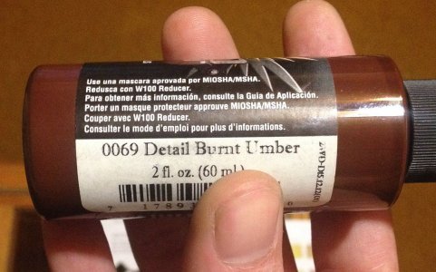
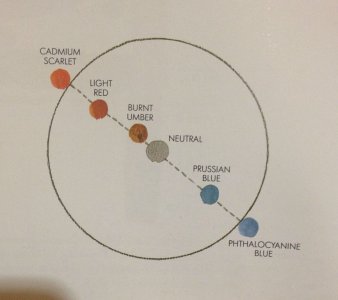
What exactly is burnt umber? I have a set of primary colors that I'm using to learn basic colors lol.
 
Oh awesome! How'd you make that color wheel thing? I figure I can buy 3 big bottles of paint and make any color I want.
 
Oh awesome! How'd you make that color wheel thing? I figure I can buy 3 big bottles of paint and make any color I want.
This is what I do. I have black, white, and the 3 primary colours. I make pretty much everything I need with this. I do also have a sepia, and also a fleshtone which I use as a base to work from to get th e right colour as I find it easier for skin - but that's just for convenience and lazyness lol.

Make sure you get the true primaries , and not just a shade of blue etc. :)
 
Oh awesome! How'd you make that color wheel thing? I figure I can buy 3 big bottles of paint and make any color I want.
If you have the 3 primaries... In theory you can make any colour.
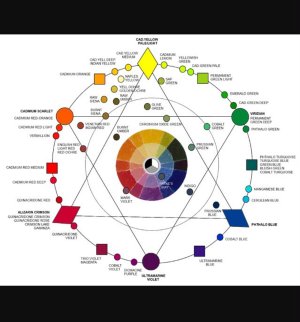
Here's a colour wheel that is available for reference online
image.jpeg
you can pick up colour wheels on line https://www.amazon.com/Color-Wheel-9-1-4/dp/B000I1TFMK or at a shop.
I have one of these and it helps to show what to expect when you add a primary colour to the other colours on the outside of the wheel.
oops sorry the pic is a bit large LOL

I have that exact colour wheel. It's great tool :)
 
If you have the 3 primaries... In theory you can make any colour.
Here's a colour wheel that is available for reference online
View attachment 48075
In theory yes in reality no. If you look at the colour wheel, with the triangle, you can create all the colours within the triangle between the primaries. You can not create a pure Orange/Green/Violet, but it depends what you are painting, there are no pure colours in photo realism :)
 
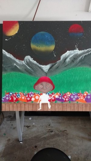
Thanks for all your help! This is where I'm at with it now, I use some of the Blending techniques from above to do the Main Mushrooms head.
 

Attachments

  • IMG_20170405_095016223.jpg
    IMG_20170405_095016223.jpg
    782.7 KB · Views: 23
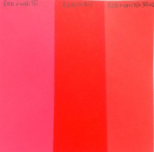
Here's the results after I tested the theory of the video I posted earlier.

I uses Createx Illustration colours's Scarlet, Yellow, and white in the test. You can see by using a white and yellow mix with the red you get a lighter and brighter red instead of a pink by just mixing red with white.

red_shades.jpg
 
Back
Top