S
shanek864
Guest
once we get the image filled out do we post our pics on here or send you a message?
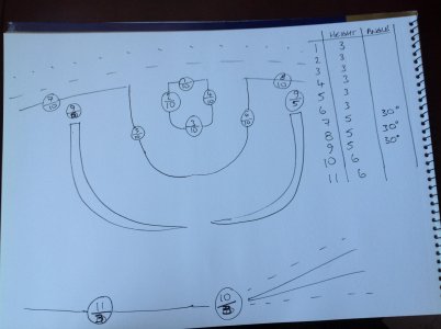
Very much so Tufty, I agree that you could pull off those effects in each case - I like what you've done adding the height in the top of the little circle instead of the effect number. Makes perfect sense. I'll edit that in the language.
") well done!
well done!Just post pics on here. I'm not supposed to leave the class unattended so i'll see it!once we get the image filled out do we post our pics on here or send you a message?
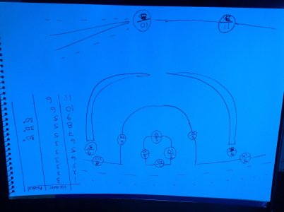
I was a little confused with the height and angle details when I done it last night.
after looking at it again today I understand the table now so will have another go today.
thanks for the feedback.
 not sure about the angle thing but this is what i came up with
View attachment 5753not sure about the angle thing but this is what i came up with
.JPG")


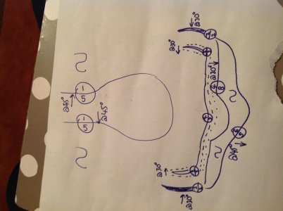
 f iris...

I like what you've done here Adz - with that backfill symbol, you need only use it oncethis is how I see it /would do it, the outer most line is the iris, used the side ways s in the middle to rep backfill, also forgot to add 8's for texture inside my blend lines oView attachment 5819f iris...
I like what you've done here Adz - with that backfill symbol, you need only use it once
The top effect i would actually angle in the opposite direction. However the reference makes it appear as though it is blending in this way. Follow this class for the month and i will show you why the effect goes the opposite way to how you have drawn it.
Also, take another look at your opacities - i think some of them a too light (and they need only be a number between 1 and 10!) I think your eye could definitely work in this way though.
Teacher sir, please sir (got my hand up) although I'm not entirely active in this, I am reading and paying attention to everything that's going on, and I'm impressed with the rest of the class so far.
I was actually thinking of asking Tufty to do my homework (As an alternative to bullying him of course) but I'm afraid I might get into trouble and maybe even get expelled,
.