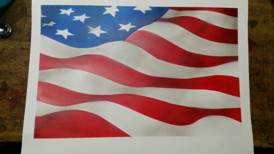
Was getting a little bored so figured I would attempt something, key word TRY. I did not use a reference and just winged it. Came out absolutely horrible. I just really struggle with the whole 3D concept. It is just amazing how bad something can look that's not supposed to be "difficult"... Oh well hopefully one day I can make something I'm actually proud of.... in the very far future
Do you have pic? Someone could give you pointers. And def use a ref next time. Then you can see where the shadows and highlights that make any ripples, etc go, without guessing. Later when you get used to how to paint them, you can design your own.
That looks far from horrible to me. Just need to work on your shading. So think of it as peaks and valleys, the valleys are going to be in shadow, and the peaks brighter, plus all the other little random cross ripples etc, are their own individual areas and the high and low spots there should be treated the same too. A ref will help guide you as to where shadows and highlights go and where light does or doesn't hit is really what gives the 3D look.
After reading your post the 3D flag makes much more sense... thank you for that. I'm going to give this another go tonight/tomorrow.
It almost looks like you have not even started with the shading and highlights. This is how I do flags. https://avwairbrushworks.wordpress.com/2016/08/03/flag-step-by-step/
I think it looks amazing already Once you get the extra shading and highlights in, it will be crazy cool