Adding color to subjects

K

kelonio

Guest
Hi all,
need serious help on this one : )....i ussualy do monochrome (b/w) paintings...but moving now to color....when painting objects; i Will like to know the best way to reach a "realistic" look in color.
Shall i do first a monochrome (say in sepia) and then add the colors? or shall i do the lets say, the same process like in Denisse´s face? (strait color to the canvas).
Lets say you are doing a cloth with folds and some wrinkles...how shall i do it? gulp!!! with monochrome first and then what kind of colors? Or strait color to canvas?..transparents, buffered, opaques?...which order?
All help and answeres will be of great value...please be explicative.
Thanks a lot in advance and sorry my poor english.

 
Wow lots of questions, each likely needing a full page or two to respond LOL..There's lots of video's out there showing the basic layering process..You can kinda do it both ways though your initial layer for a color piece should be the base color in that area of that reference, though if you monotone a roadmap down first, expect to use it as just a guide and do it lightly so you can cover it easy, then tone it darker with a darker variation of the same color so base still comes through in the correct places..If working in opaques, just start with your lightest colors you can see in the reference and work to your darkest, blend or texture on top pending on the reference type..Just take it slow, use the same idea of monochrome painting but instead of just making each layer one tone darker, in essence the color picture is just a different color each layer, ultimately similar principle though...

My general layering sequence say for cloth is to paint the base color in a pretty even opaque tone, utilizing a color that closely resembles the lightest colors I can see in the reference. Strengthen that color, again in opaques and do all the folds, but still allowing the base opaque to come through as highlights and to blend the darker tones gradients into so it appears to gradually lighten as it comes out of a fold..Then use a similar color in a transparent and use this to blend or introduce a richer/darker color into the fold shadows..May not make too much sense but basically build it with opaques and blend with transparents to finish..GL
 
Like rebelair stated above this is not something that can be answered quickly. Basicly you are asking us "how does one paint?" and there are books written about that so its a tad hard to answer that in a forum post.

All the methods you mentioned are viable methods (and a lot of people will use serveral of them in one piece depending on which achieves the desired result easiest), yet each and everyone of them will requier practice. Don't expect to be able to go from black and white to color without a lot of trail and error, its a different technique which you will have to learn.

When starting out with colors I'd first start practicing with opaques (easiest as they will react the way you expect paint to react), and start at the base. Read up on the use of them, make a color wheel etc. When you have the hang of opaques do some research on transparants and start practicing with those.

When you have some experience with both types of paint you can decide which works best for you or start combining them.

Like I said there are no easy answers to your question other than start practicing. When practicing you will probably run into problems but those will be more specific and easier to answer on a forum.
 
I am finding this issue myself , monochrome has been my choice lately, not that I have not painted in transparent colors. Now going back to doing a monochrome under painting, then wanting to add color, it's a whole different thought process. I have even just started a project over, as the color going on was too heavy , my trial at lightening even went wrong. So it was time to sand it off and start again.

Now I have a very light under painting with a reduced black. Color will be next,I will go with transparents and or buffered/capped colors,depending on what colors I am aiming for.m


Sent from my iPad using Tapatalk HD
 
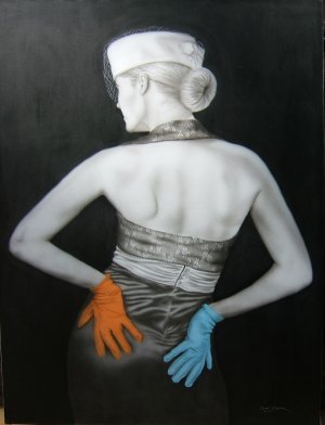
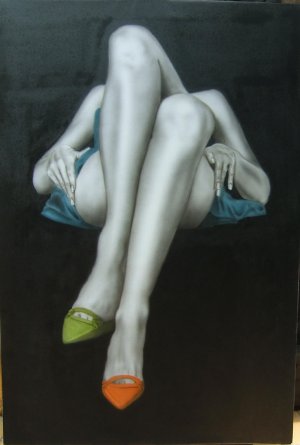
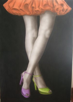
Thanks and thanks for all the feed back on my questions, here trying to post some of my work, but dont know if i am doing this loading correct...maybe here you may see where my problems areDSCF2666.jpgDSCF1539.jpgDSCF2132.jpg
 
Adding to my previous post i will say, all places where color was added i first made a monochrome in tranparent smoke and tranp black (comart)....then i just used tranparent comart colors and coverd all basically to full value and then try to erase highlights...on the first picture: Gloves, and on the 3rd: The dress...needs more highlights...they look for me to flat.........maybe also i shall keep the light areas with less paint so more easy to erase.................with tranparent colors is hard to to keep the smooth transition from dark to light....so i assume of what you all said, i am missing some steps in the process......thanks again for your comments
 
Adding to my previous post i will say, all places where color was added i first made a monochrome in tranparent smoke and tranp black (comart)....then i just used tranparent comart colors and coverd all basically to full value and then try to erase highlights...on the first picture: Gloves, and on the 3rd: The dress...needs more highlights...they look for me to flat.........maybe also i shall keep the light areas with less paint so more easy to erase.................with tranparent colors is hard to to keep the smooth transition from dark to light....so i assume of what you all said, i am missing some steps in the process......thanks again for your comments

I would agree that perhaps if you wish to keep to your highlights as you described, less paint would be better here.
I would remind you that it's much easier to add paint [darken] to an area, than to lighten it up [erasing].
 
Back
Top