first attempt at color.

C

Chalee

Guest
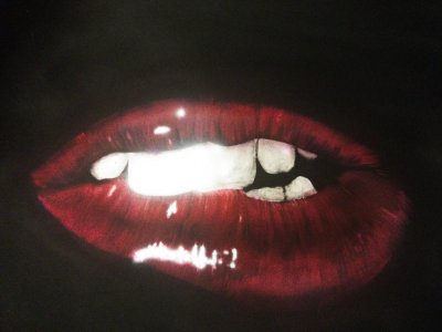
Done monotone stuff almost exclusively decided to get into color and do some anatomical studies to practice texture as well. My first project a set of lips. Went well until I tries to "fix" it. With some highlights and whiten the over sprayed teeth. Since my eraser wasn't having any of it spell messed it up a bit. I'll probably mess with it some more tomorrow see if I cannfix it. I started out with scarlet very lightly. The magenta, then blue violet. Finaly black. Siggestions thoughts. Be gentle it was my first attempt at color. Also my first time using createx illustration colors and I have to say they spray quite well at 20psi with no reduction. Thou I'll stick with my over-reduced detail colors for very fine lines.
 

Attachments

  • IMG_20150323_005143~2.jpg
    IMG_20150323_005143~2.jpg
    281 KB · Views: 111
Last edited by a moderator:
If you didn't say you over-lightened the teeth I would never have known.
I still think it looks great the way it is.
 
Looks great for a first go at colour, id would have been happy if my first one came out like that :)
 
For a first go at color I say well done. The over highlighted area on the front two teeth is just a bit too much , Meaning with the line you see to the viewers right of them look off.
But it does pass for a close up with a flash on camera shot of a ladies lips
 
The highlight on the teeth is one of the parts that I'll be going back to fix. NOT meant to be highlights. Thats called forgetting to mask the teeth while fixing the lips, then spraying unreduced white at 12:30 am to fix it and not chucking the needle. LOL. Tonight I'm going to mask them get a nice even white on them and get the color in there. Will post the corrections. Fist time using Bristol #300 100 lb. Very smooth and nice with the eraser and illustration paints if your quick about it. I like it.
 
Great 1st go!
My only suggestions would be to re-define the front teeth, then try and add some smoothness to the rest.
The shapes are great, but lack the surface texture.
Other than that, the colours are real good.:thumbsup:
 
Looks good, very Rocky Horror show Lol. Fix those teeth (if only it were that easy in real life lol, no dentist required) and you have a winner.
 
I don't think you really need to worry about the highlights on the teeth, just go in with a shading tone and re-define them, like splasha said. I think the highlights on the lips are a bit intense though. I'm not really sure how to fix it, which I apologize for, but I think if you left the intensity of the teeth, and toned down the lips, it could be a pretty successful piece. I've also worked primarily with monotones until recently, so I'm trying to figure out the color thing too.

Not sure if it would work, but what if you extended the texture of the lips into the highlights? This would help to both define the highlights a little more, and add a little contrast and tone them down.

Hope this helps.
 
I's be willing to bet if you reduced that Scarlet and really lightly misted that highlight area of the lips that it would tone it down a bit and give it a more realistic highlight. Remember that a highlight is seldom actually white unless an object is highly reflective. Those are the glossiest lips ever. For a second go at color, i'd be pretty happy. Nice work!
 
Back
Top