Mixing color tips

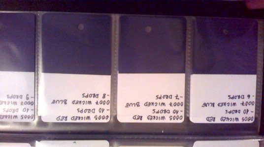
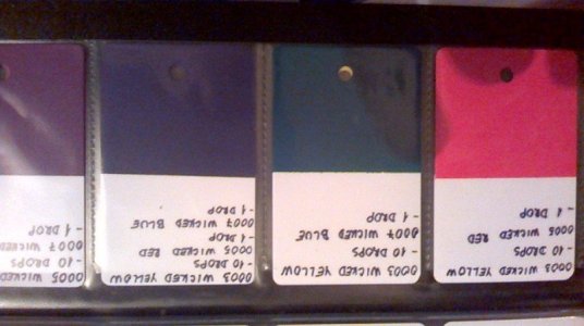
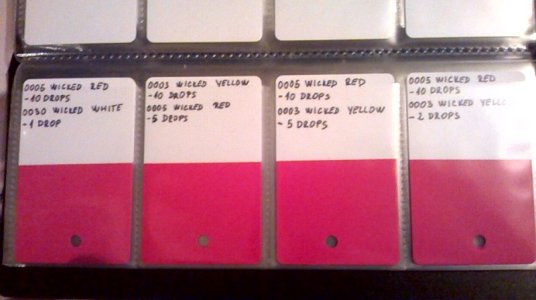
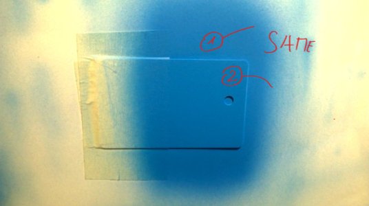
I am doing exact same thing. I do it on plastic ID cards and save them in business card holder. I seen people using spoons, but It was unpractical for me to have spoons all over my place. Busineess card holder is working nice for me. Looking like this. Few photos:
WP_20180417_002.jpg WP_20180417_003.jpg WP_20180417_001.jpg

my phone is crap and I don't mind :)
 
Now that is a slick idea. Plastic cards? Where do you get them
I bought them on amazon uk , cause I order bunch of stuff there, so I try to get multiple stuff in one delivery, so I save on shipping. But Jacky gave a good link.
 
One more little thing i noticed when I started with this. When I made wet coat instead of dry coat it was hard to identify colors, cause there was just to much shine. So I decided to go only dry coats, most of my projects will be dry coats I assume and if I will need to see how wet coat looks I can always take dry coat formula which I like and spray one id card in wet coat so I see if I like it.
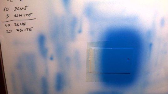
I spray bunch of dry coats untill it's fully saturated like you see on picture. The same color on paper and on Id card. It can't go any more darker. That is the max.

Maybe this few tips could help you. Here are some of my famous ugly pictures lol

WP_20180418_001.jpg WP_20180418_002.jpg
 
Good video, his colour stop method is the same as “Buffered” from Dru Blair, personally I don’t see much value in making the papers as I believe practice and gut intuition is key, also what happens when your manufacturer alters the paint tone? I know Createx tweak their paints so I would imagine others do to?
Anyway - great video, and if you want to get better at colour matching you need to isolate the two colours from their surroundings, si when he put the test paper on the target colour he should of used a piece of paper with a small window cut out. In this instance it didn’t mater as it was single blue colour but trying to match tones on a reference is rarely that simple!

Yeah, Daniel Power calls it 'colour capping' and it's a safe way to paint if you're heavy handed with transparents (which I tend to be :) ).
I was thinking the same with the 'window' as surrounding colours can confuse the issue. I also agree about the colours changing but this is very handy for a one-off piece if you need to mix more colour. They can also serve as a starting point for skin tones on new projects.
 
I love my Id cards and I am very happy I decided to do them. They are usefull like pantone colored match system i have to ''me''.

To each their own I guess. I don't spend bunch of money on small bottles, I need few liters of primaries and I am good, I don't mix any more diarrhoea looking colors, I can reproduce exact same color FAST one week later or one month later, I can show my cards to others so they can pick color which they like and so on. I won't touch production aspect of airbrushing and how to replicate the same exact color fast. It all depends from the goals. But I know this kinda systems were used from way back in bunch of other industries.Even automotive. There is no universal solution to every problem I would assume. I love them :)

But I do understand I am new to the game so I know there are bunch of solutions. This one works perfectly for my needs. At least for now lol

And I am sure not color matching by my eye and lose one frikin month to get the right color now :D
 
Yes, what ever works for you is the correct method!
Many plus points etc! I just find that no 2 skin tones are the same! There’s at least 6 variations per portrait! But if you are producing work that needs replication then this system would be perfect!
Createx just changed the hue of sepia! That would make my skin tone cards basically redundant :(
 
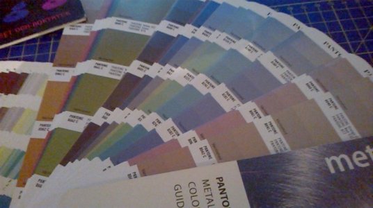
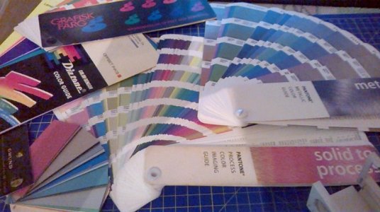
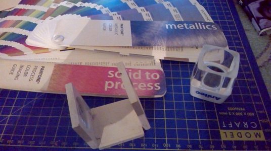
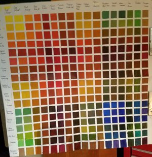
I went and made few photos of my color books, just for the sake of topic and some info which maybe some new user in color world would find interesting. I have 2 tools on the right side of one picture which are basically magnifying glasses which you use to compare colors when you color match. It is similar to the stuff musicmacd talk about before about isolating surrounding colors. If you use magnifying glass up close you practically can't see much around the area which you are interested(so you basically isolate the colors which you wanna compare and you see better). Few pictures just for fun:

WP_20180418_004.jpg WP_20180418_005.jpg WP_20180418_003.jpg
 
LO RES 20180418_205027.jpg
I went and made few photos of my color books, just for the sake of topic and some info which maybe some new user in color world would find interesting. I have 2 tools on the right side of one picture which are basically magnifying glasses which you use to compare colors when you color match. It is similar to the stuff musicmacd talk about before about isolating surrounding colors. If you use magnifying glass up close you practically can't see much around the area which you are interested(so you basically isolate the colors which you wanna compare and you see better). Few pictures just for fun:

View attachment 53660 View attachment 53659 View attachment 53661
I think it's an excellent idea! I'm an oil painter. I suck at it, but I love it. Years ago I took the time to do a color chart of every color on my palette. It has been a priceless reference tool. . especially for flesh tones. I specifically use Gamblin oil paints and while their formulas haven't changed much through the years, it's wonderful to have a "launch pad" when tweaking becomes necessary.
 
Last edited:
View attachment 53672
I think it's an excellent idea! I'm an oil painter. I suck at it, but I love it. Years ago I took the time to do a color chart of every color on my palette. It has been a priceless reference tool. . especially for flesh tones. I specifically use Gamblin oil paints and while their formulas haven't changed much through the years, it's wonderful to have a "launch pad" when tweaking becomes necessary.
I love to have like you sad "launch pad" :D Usually people don't even notice few different tones of the same color if you show them something, so even if formula of paints are getting changed I am still quite close.
I did spray ID's of primaries which I use, so I would notice if they change them and I wouldn't wonder why some colors are a little off.
But my experience with pantones color books were more chaotic. If I asked someone to pick a color which he liked, he was lost. People couldn't decide what is color which they would like to use. To many choices I guess lol
 
Pantone books are great if you are mixing ink for a printing press. The primary colors are cyan, magenta, yellow and yes, black. Printing is the only application that considers black a color. There is also a lot of premixed colors used to achieve certain colors....reflex blue, 032 red, just to name a couple. These cannot be mixed using just primary colors. These primary and premixed colors are industry standards and do not change from manufacturer to manufacturer. Unlike airbrush paint. I have had the same color bought a year later and it has been different. try this airbrushing...if you achieving a color by mixing transparent paints on the job, lets say orange...if you start with red down first, then spray yellow you will get a certain orange. Now try that with red over yellow and the orange will be slightly different. This happens in printing when you have a certain color wanted by a customer, and you can not achieve it by the order the primaries are laid down. Switch the order and ..bam...there it is...
When using the four primary colors on the press is called 4 color process and the color is laid down using dots and the colors are achieved using overlap of these dots. You can achieve any color using this process. And it is done with certain colors used in a certain sequence.
When I mix a color that I know I will have to use again, I write the mixture down with the spray out and take a picture and keep that with pics of the job. This way I do not have all these little cards either getting lost or destroyed...
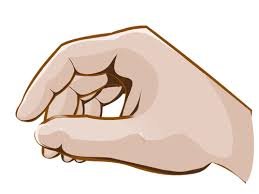
And an easy way to look at color when trying to match, is to use your fingers to make a circle and look through that...it will block the reflective lights and give you a great view of the difference if any...or you can use a black card or paper with a hole punched in it. If you were to put two colors side by each, it may look close, but place the black card with the hole over the both, you will notice it really is off...
images.jpg
Cheers
 
I'd like to add to keep in mind your light can make a difference when color matching, the 3 to keep in mind are the older bulbs put off a yellow hue, the newer fluorescent lights have a blue hue, then you have sunlight.
 
Back
Top