E'tac EFX color wheels ?????

RichardH

Detail Decepticon!
I printed out the shade, tone and tint color wheels that Etac provides and have a real problem figuring out how to read them.
I fully understand going around the wheels how to make the colors but when going into towards the center of the wheel, what is added to make each color darker. I just can't get my mind to work for that.
On the shade page, take for instance the Phthalo green. To make it darker, do I add Burnt umber or gray or sepia smoke???? Same green for instance, on the second layer toward the center, do I add golden ocher?????
Green is a cool color , so if I add a warm color will it darken the original????
Hope someone will enlighten me on this because it is comfusing for my muddy brain.

Thanks

Richard

 
I was taught to use the opposite color on the wheel so Phthalo green to darken it I would use Pyrrole Red But I do not use etac but mixing colors is universal
 
I was taught to use the opposite color on the wheel so Phthalo green to darken it I would use Pyrrole Red But I do not use etac but mixing colors is universal

I have to take my pooch to get a bath and haircut so I'll try some experiments this evening. Seems like I read here that was the way to do it, so I'll give it a shot. Time for a little shine also.
Thanks Herb.
 
I have been overly blessed with large amounts of shine as of late. I think it is now up to 14 gallons ranging from Blackberry shine to George Washington's Rye.
Now if spring will ever get here so I can have a hog roast :D
But I was also told to use the opposite color that way you always have a cool color with a warm color .
 
I printed out the shade, tone and tint color wheels that Etac provides and have a real problem figuring out how to read them.
I fully understand going around the wheels how to make the colors but when going into towards the center of the wheel, what is added to make each color darker. I just can't get my mind to work for that.
On the shade page, take for instance the Phthalo green. To make it darker, do I add Burnt umber or gray or sepia smoke???? Same green for instance, on the second layer toward the center, do I add golden ocher?????
Green is a cool color , so if I add a warm color will it darken the original????
Hope someone will enlighten me on this because it is comfusing for my muddy brain.

Thanks

Richard
I don't know how your e'tac wheel works without seeing but I'm guessing you have a piece of the wheel missing, my wheel has an inner wheel and an outer wheel, the outer wheel has windows that correspond with each if the colours as they go towards the centre, when you highlight one of these colours the our ring of the outer wheel points to the colours needed to get each of the shades you can see on you're wheel, again in not sure exactly what you printed but I have a feeling that you should have two wheels so that one covers the other and is pinned in the middle so you can turn the outside on to the colour of yiur choice, my wheel also states on the back what black and white will do to your mixed colours.

You don't make colours darker or lighter by adding black or white, you generally use the colour opposite on the wheel to make it darker.

Don't add umber either unless you're going for an adjusted umber.

Maybe show exactly what you have printed out, I woukd prefer to buy a genuine pre-made wheel because what you see is what you get whereas printed out a copy from the net doesn't guarantee the colours are true to what you have sue to sufferebces in printers and ink quality and also you might not have the information that is usually on the back of the wheel.
 
Malky you can find the etac colors wheels in this thread http://www.airbrushforum.org/threads/etac-color-wheels.11540/

Well even I'm baffled now, I reckon those sheets would have had information on the back relating to their use, my own wheel is far easier to use but concerns only true primaries, secondaries and the warmer and cooler colours, turning the outer wheel shows how you get the colours coming toward the centre, the back has a grey scale finder and other information.
 
Well even I'm baffled now, I reckon those sheets would have had information on the back relating to their use, my own wheel is far easier to use but concerns only true primaries, secondaries and the warmer and cooler colours, turning the outer wheel shows how you get the colours coming toward the centre, the back has a grey scale finder and other information.
Yes that sound like the same color wheel I have as well . :D I like simple
 
That is where I got the color wheels Herb. It shows each labeled color ( though it won't be exact to what is in the bottle since the printer can't match exactly ) but it does give what can be mixed with what to get another tone or shade.
I also have the simple color wheel that you both have and I guess I need to just play with some mixes to see what happens. o_O:eek::confused::confused:

Thanks
 
Ok, you only need the first 2 (the EFX and the Private Stock tint/tone/shade) sets of colour wheels.

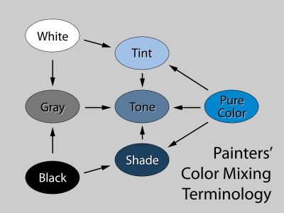
When you are 'moving' a colour around you are either shading, tinting or toning the colour so I'll give a quick rundown of each.
Tinting is when you add white to make the colour lighter, shading is when you make the colour darker and toning is when you are 'dulling' or 'toning down' the value of the colour so...
The tinting wheel shows you some steps as you add white what the colour will look like (or a target if you like), it's the same for the shading only you're adding black.
The toning one can be used after you use the other two to get you colour value right but it may need toning down and to do that you add the colour directly opposite to neutralise the colour.

Try not to worry about the colours that don't look right (like flesh tone etc) and any colour wheel is just a guide and will work just to give you directions to 'push' your colours around.

For an example, say you have a standard red that needs to be a bit bluer, check the chart and find a colour that's close and that will give you an idea of what type of blue to add. Once you get this value right you may find it is too 'bright' so you would either use some white to tint it down OR you could add some of the complementary colour from the opposite side of the wheel. This colour may need to be mixed as well and you can do this on the fly with experience (just add the 2 colours as you would do to make any colour).

I hope that makes sense :)

Also be aware that when adding strong colours such as black, dark blues and greens etc that you need only a drop or two. So start with the lightest colours first as you can always make them darker but it takes a lot more of the lighter colours to bring them back and you'll waste a lot of paint!

Have a look at Mitch's colour wheel tutorial as he explains this well, just have these colour wheels with you and pause the video and take a look and see if you can work it out :)
 
Thanks @OzAirbrush for the info. It is starting to make sense in this old brain. I usually haven't been able to match a reference but now my paintings are getting half decent and want to start matching the reference better. I've been doing monochrome so I don't have any colors to match and now want to learn more. You and others have helped a lot from here. Hope someday I can repay with advise for something someone needs to know.

Thanks
Richard
 
I as totally confused by hose too. I have he old fashioned one like Herb and Malky. After OxAirbrush explained it's a little clearer how to use them but I think I will stick to my old wheel.
 
Yes I find them very confusing, it’s good to see where their colours sit on the wheel, helpful if your using Etac
 
On the EFX wheel specifically, why are some of the colors in the middle of areas completely out of place? Like the flesh tone and burnt umber. It doesn't make sense.
 
On the EFX wheel specifically, why are some of the colors in the middle of areas completely out of place? Like the flesh tone and burnt umber. It doesn't make sense.

I have no idea and just ignore them. Really, you only use the colour wheels for a while as a guide to know which way you need to 'push' your colour around. As long as you know where the colour lies within other colours and where its complementary colour is your sweet :)
 
Last edited by a moderator:
On the EFX wheel specifically, why are some of the colors in the middle of areas completely out of place? Like the flesh tone and burnt umber. It doesn't make sense.
Because they are not fully saturated which would put them on the outermost side of the wheel
 
The colours that are out of place shows that they are already tinted or shaded and they have not got a "pure" colour. I agree it would have been better if they just left those colours unmarked on the wheels where they are not applicable because now I can not see what a tinted Napthol red looks like because they filled the block with a shaded Napthol colour.

I don't think they wheel will be updated because Marissa or Eddie Wouters does not use it anymore.
 
The tint tone and shade wheels are set up by the definitions of tint, tone, and shade
They are separate from the primary wheel which has you use opposite colors to technically not darken but desaturate.
Truly darkening or lightening is actually tinting or shading
upload_2018-4-24_6-32-51.png

tint=add white
tone=add grey (or black and white)
shade=add black

tint page white moves towards center
tone page grey moves toward center
shade page black moves toward center

it would be less misleading if they would not have left the grey in the middle where it resides on the primary wheel for all three
 
Last edited:
Back
Top