How to know how dark to go with underpainting

S

Smiler65

Guest
Hi all,
Might be a stupid question, there is some great sbs's on portraits on here, but I'm itching to try a colour portrait, or at least part of one to practice, just how do you know how dark to go before you add colour.
If I start in umber or sepia, then start using say red ocher to start the colour won't this also make the shadows, darker areas even darker taking them further than they should be.

I hope that makes sense.
 
I was going to try it on my sugar pic I just done but was a bit scared and I also didn't have the time to redo it if it went wrong.
I'll prob just start with an eye and partial face to begin with.

Should say I'll be using Etac marrisa colours
 
Everything you put over the underpainting should be transparent and only shift the colours.

So if I do a mono portrait ,working from a mono print out, and get my tones,values right. Then hit it with colour it will not get darker but start shifting to skin colour?
 
Long story or short? If using trans overlay, don't do an underbase, if your doing opaque, use 3 distinct shades a light tan, add some orange to the tan for a skin tone, or more brown for darker skin and then a really dark version of that same tone. Paint 3 layers once with each of the 3 shades, on the first layer with the tan, map it all out, paint your darkest shades at 100% intensity of that lightest skin tone..leaving your highlights and midtones as white and oversprayed. Get your midtone and build from midtone out to the darkest 100% intensity area's again avoiding your highlight area's. Then now do the same with the darkest opaque tone and build your darks, so in essence that last layer is to bring out the details. obviously you can include texture in that layering sequence also. finally to remove the chalkiness that opaques create, use a transparent dark skin tone IE Dont add any white at all and use that to blend all the previous layers and to again redetail features and shadows.

But saying all that you can do a base in any color if its kept super light as the later opaques will cover and absorb it but if doing colour it is a good idea to do that mapping layer in a light transparent that suits the gamut of color the portrait itself uses, Often I use a darkened orange, very reduced. very occasionally use black but pays to be careful with black on portraits..best of luck
 
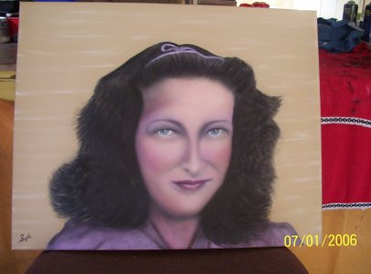
I think it all depends on who you talk to and what aproach they use as there are a lot of different way's "floating around". Even the standard (opaque or transparant) aproaches will varry person to person as everyone puts his/her own twist on it.

I've done a couple of portraits but seem to change the way I do them atleast a bit each time so it might be an idea just to read up on some step by steps and make some tests to figure out what suits you best.

As for how dark you can go, that thus will depend on how you build your layers. Some experience in how your paint/color behave is also essential when working in transparants and the only way to get knowledge of that is hands on experience (after you know color theory ofcourse).

The way I did my last few portraits I basicly split the "underpainting" in one for the light and one for the dark areas.

-In the darkareas and darker midtone areas I start with umber (most of the time) and you can go as dark as you want (don't exceed the greyscale though).
-In the light areas (and lighter midtones) I use fleshtone and try to aproach the greyscales (don't hit the highlights)
-After that I do texture
-Next I hit/blend it all with flesh tone. This way the texture parts in the darkest parts get a nice fleshtone hue. this is also the reason you can hit max greyscale here as you will slightly lighten it now.
-next phases are adding color, texture, correcting greyscale etc and I end with adding the real darks.

The above is just how I do it at the moment (absolutely not saying it'sthe way to go, its how I do it) and just came about by actualy painting ortraits and (and this is important :p) studying what what I did actualy resulted in. That way you start to build experience and knwoledge and soon find that you start to put your own twists on know systems.

That being said for my next one I'mgoing to let go of the above and try to see where the "buffer system" will lead :)
 
That being said for my next one I'mgoing to let go of the above and try to see where the "buffer system" will lead :)

Opaques and the "Buffer System" do get more accurate representations of color, but it's definitely more time consuming. I personally only use matched opaques anymore when there are subtle changes in hue/saturation/value. Opaques are great when they are subtle changes or less texture is required, like skin tones. Areas of high contrast and a lot of texture, transparent paints work better.
If I weren't drinking tonight and had more energy, I would continue on, but that just doesn't seem like it's going to happen. :)
 
I`m afraid i don`t understand any of the technicalities being offered you. But they obviously know what they`re talking about. Here is one i did using Trident paints. I just started with white base coat, followed by a very light pink, and just experimented from there . I`m happy with it and don`t give a rats if no one else is. In the long run it`s you who has to be happy with your end results. Sorry i can`t offer you more advice, and hope you do really well with portraits. My photo may not do my painting justice, as i am a bum photographer.
 

Attachments

  • 100_3566.JPG
    100_3566.JPG
    203.4 KB · Views: 38
I got bored with portrait type pieces, although i never achived photorealism i did manage some fairly close pieces. And actually find them easier than illustration type pieces.. i think thats mainly because most edges are soft and i need very little masking. Im lazy and hate to mask.

I approach portraits by transparents mostly. This has the advantage of speed. When i have color matched i never found going too dark to be a problem. Im generally furiously trying to darken at rhe end
 
Your red ocher is translucent not transparent, meaning it will darken a little and will eventually cover,
Get your darkest shadows to correct tone with umber, grey, sepia etc, but leave a little room at the edges so you can blast over your darkest with red ocher in toward your mid tones. The idea is warning up the flesh areas before the flesh tone is down,
So yes..... leave a bit of space as red ocher will darken and warm whatever you put it on
 
I had to change the way I do portrait for a obvious reason ;) I only use 2 colors for my under painting . these colors are more or less opaque but I use them like I would use a transparent . in other words I build my colored portrait up like I would do with a monochrome portrait .
for the darkest parts I start with grey the rest is build up with a skin tone
 
Even though described differently in my post, I like rons way also and is the way I paint too (In a way), personally for speed I don't use a full opaque system, rather use highly reduced opaques which are more semi-opaque when sprayed, this way you can really utilize the white or background colour in your work, but I do think that's where beginners need to start venturing into color, most beginners just aren't ready for too much transparent work unless you come from a watercolor background and understand transparent and color theory really well. But ultimately you approach color in the exact same way as greyscale, its just color instead so no need to be too scared of it, match 3 basic color tones well from the picture, a light a medium and a dark and you cant really go wrong..overthink it an you will struggle..Good luck, show us how ya go..
 
There you go I don't even know what paint I've got:eek:ops: and I want to do a colour portrait.:whistling:


Another thing to remember is the fact that you are creating a likeness. Otherwise. might as well just take an enlarged photograph. Your portrait should be immediately recognizable as the person , also their essence , and their mood at the time. Don`t be too hard on yourself, just enjoy what you do.
 
Back
Top